

When the Code Got Cheap
How TypeUI became the business after AI cut the price of Flowbite's components
Key Lessons
- •When the model writes the code, sell the rules it still gets wrong
- •A design skill is a markdown file the model has to follow
- •A color change is not a test. Watch the path.
- •Write the page you want a model to cite
- •Show a customer's site instead of stamping a watermark
The earlier years are in the Flowbite journey: the rejected template, the Black Friday spike, the open-source library, the one-time sales that reached 70k a month. This is what happened when that code stopped being scarce.
November
Flowbite had brought in between 2 and 3 million euros over five years. The margin sat near 70% after tax. Robert and I were still two people at Bergside. The product people paid for was code: components, sections, framework kits.
Then the models started writing that code for almost nothing. The drop began in November. In three months we were down about 70 percent. The full fall was 90 to 95 percent.
The library did not die. It still does more than 500,000 downloads a week on npm. People install Flowbite. They stopped paying for the files.
Flowbite’s paid components fell 90 to 95 percent once models could write that code, while the free library kept doing more than 500,000 downloads a week. The installs proved the brand. They did not pay the invoices. When a model makes your core cheap, the scarce layer moves. Zoltan moved it to design rules the model has to follow, and to the analytics that say whether the page works. Look at the line item a model just made free. Price the next thing it still gets wrong.
February, and a Reddit post
We started TypeUI in February. The job was to take what we already knew about UI and put it where a coding model can use it. The launch was a post on Reddit. It reached close to a million views. We did not buy that traffic.
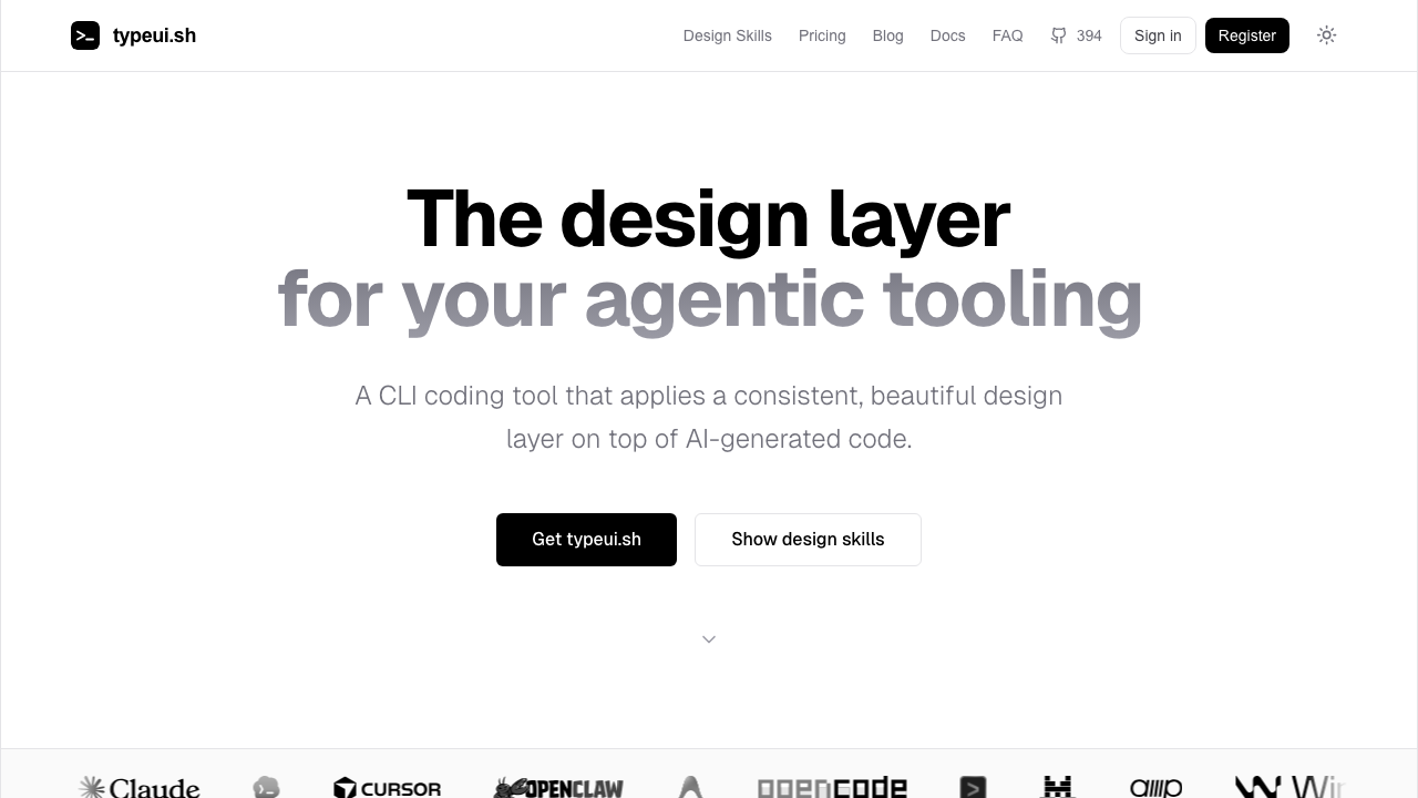
Creative: the file the model has to follow
Creative is the design half. I treat it as the source of truth for the model. A design skill is a markdown file. It says how a button, a navigation bar, a space, and an accessible control should behave. Robert wrote those files. He has fifteen years in UI and UX. I would rather hand the model that file than start the job in Figma.
The Creative plan is $30 a month. It includes animations, sound effects, a BrandKit, and UI and UX audits.
I used it to build two sites in the shape of Airbnb. I changed the colors. The feeling stayed. That is what a skill is for. The system holds when the palette does not.
TypeUI’s design skills are markdown: buttons, navigation, spacing, accessibility, written by a co-founder with fifteen years in UI and UX. Zoltan would rather give a coding model that file than start in Figma. A Figma board is a picture the model has to guess at. A markdown skill is an instruction it can follow. If you sell taste to people who generate code, write the taste down in the format the model already reads. Then charge for the file, the motion, the sound, and the audit, not for another component zip.
Insights: the path that looked fine
The color demo is the pretty half. Insights is how I know the page works. It is website analytics on Cloudflare: heatmaps, dead clicks, rage clicks, and scroll depth. A pageview does not tell you that someone hammered a control that does nothing.
We changed a flow and sent people straight to the pricing page, past login. Signups fell 79.82%. The charts showed the break. We put the path back.
Sessions do the slower job. I can follow one person through the funnel and see the step where they leave.
We are building a Chrome extension so those clicks show on the live site, not only inside a dashboard. The next piece I want is a model, connected through MCP, that reads the recordings and names the dead clicks and the loading stalls.
Recurring revenue sits between $4,000 and $6,000 a month.
TypeUI could keep two Airbnb-style sites feeling like the same product after a color change, and still lose 79.82% of signups by sending people to pricing before login. The palette held. The path did not. Heatmaps, dead clicks, rage clicks, and scroll depth are there so a traffic number has to explain itself. If you ship a redesign, read the step where people stop before you congratulate the visual system. A consistent feeling is not a conversion.
Three plans
The long shape is three plans: Creative, Insights, and Growth. Growth is the one we have not shipped. It would test pieces of UI on its own. Half the visitors see one version. Half see the other. The design we can generate gets tied to the conversion it earns. I think that can be worth as much as 30% more revenue. I will measure it before I say it happened.
Mobile waits until the website model is real.
I also want subscribers who will mark up a landing page. That is a community, and it is a proof loop.
Where the buyers come from
Google brings 34%. Direct brings 25%. Reddit brings 10.9%. X and GitHub are in the rest. Conversion sits between 0.3% and 0.5%. Desktop is 87% of the traffic.
The content bet I care about now is AIO: posts and comparison tables written so a model cites them when someone asks what to use. Search still matters. The answer box is a new index.
The other channel that has worked is a small tool inside someone else’s product. A Chrome extension and a Figma plugin earn a backlink, and they meet a person who is already trying to design.
The price has to be a time argument. Thirty dollars a month has to buy back more than thirty dollars of hours.
A watermark on every generated page is a weak proof. A showcase of sites customers actually shipped is the better one.
At Indie TM #17 the room asked for a score from 1 to 10, and for a question at day 30, when the first month ends. That includes the people who leave. I agree with both.
Advice extracted from this journey
 Mindset
When the model writes the code, sell the rules it still gets wrong
Flowbite's paid components fell 90 to 95 percent once models could write that code, while the free library kept doing more than 500,000 downloads a week. The installs proved the brand. They did not pay the invoices. When a model makes your core cheap, the scarce layer moves. Zoltan moved it to design rules the model has to follow, and to the analytics that say whether the page works. Look at the line item a model just made free. Price the next thing it still gets wrong.
 Product
Put the design system in a markdown file the model can read
TypeUI's design skills are markdown: buttons, navigation, spacing, accessibility, written by a co-founder with fifteen years in UI and UX. Zoltan would rather give a coding model that file than start in Figma. A Figma board is a picture the model has to guess at. A markdown skill is an instruction it can follow. If you sell taste to people who generate code, write the taste down in the format the model already reads. Then charge for the file, the motion, the sound, and the audit, not for another component zip.
ProductA color change is not a test. Watch the path.
TypeUI could keep two Airbnb-style sites feeling like the same product after a color change, and still lose 79.82% of signups by sending people to pricing before login. The palette held. The path did not. Heatmaps, dead clicks, rage clicks, and scroll depth are there so a traffic number has to explain itself. If you ship a redesign, read the step where people stop before you congratulate the visual system. A consistent feeling is not a conversion.